1. In what ways dose your media product use, develop or challenge forms and conventions of real media products?
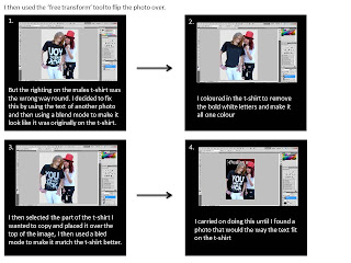
 My magazine ‘The Guillotine’ uses many of the conventions of music magazines such as ‘kerrang’ and ‘NME’ . I looked at whether or not these magazine used all of the conventions and if any of them went against the conventions. My front cover includes a masthead, 3rd left and a splash. Many misic magazines include a large masthead, this converntion is particularly clear in magazies promoting alternative genres such as rock and metal, also I edited the backgrougnd of the masthead so that it was silver/black and red i think that this mimics the look of a guillotine blade. I decided on the namke 'Guillotine' as it would be similar to the magazing 'metalhammer' which is a metal magazing and through my reasearcg i found that most alternative magazines have names comeing from either something loud or heavy. I got my models to wear black and white because at the time i was unsure on a colour scheme, however if i could go back and change it i would make sure that the man was not wearing a tshirt with text on it as i found this to be distracting and cause difficulties when editing.
Also as piercings are commonly found in the alternative scene i got her to wear a fake lip ring.
2. How does your media product represent particular social groups?
My music magazine would stereotypically represent rock, pop punk and metal music and my magazine represents this through my choice of models and mis-en-scene. I decided on a red, white and black colour scheme and so got my models to wear black and white clothes accordingly, I also introduced a red glittery hat to add an element of showbiz and pop-punk to show the different aspects of alternative music that are presented in the magazine. I chose to use teenage models to fit with the 14 – 21 year old age group my magazine is aimed at, but also include information and photos of other bands on the front cover and contents page to show the variation of the magazine and attract a wider audience.
3. What kind of media institution might distribute your media product and why?
A media institution such as conde nast might distribute my magazine because as yet they do not distribute an alternative music magazine.
4. Who would be the audience for your media product?
The target age group for my media product is teenagers/young adults (14-21) as I have found that this is the main age range of people attending rock concerts. I wanted my magazine to appeal to both a male and female audience of likeminded individuals who share a love of rock/metal music and alternative fashion. My audiecnce will generally be a C2 to E range because they are the most likely to buy magazines.
5. How did you attract/address your audience?
5. How did you attract/address your audience?
I chose models who looked like they fit the part and were members of the alternative scene.
6. What have you learnt about technologies from the process in constructing this product?
In constructing my music magazine I have learnt how to add a texture to a plain image and then use a blend mode to merge them together and give an effective pattern, i did this with the background of the masthead because it makes it look metallic.
I have also learnt how effective changint the size or font of a pice of text is and hoe important is is to keep to only 1 or 2 different font styles.
7. Looking back at your preliminary take, what do you feel you have learnt in the progression from it to the full product?
Since making the college magazine I have learnt alot of new photoshop techniques such as making skin look flawless and bright and how to use tools like the rulers to make sure the text (3rd left) is aligned. I have also learnt alot about the conventions of a music magazine and what photos work effectively on the cover. I have learnt new terminology such as anchorage and sell lines and how they are used to attract the target audience. I have also learnt what makes a successful kicker and an effective colour scheme.


